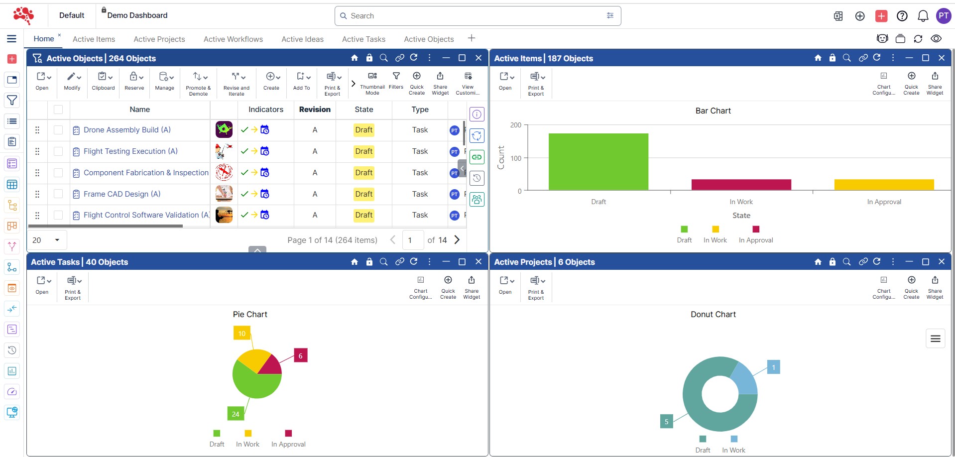
Chart Widget
The Chart Widget transforms complex product data into clear visual insights. Track trends, monitor performance, and analyze key metrics across the product lifecycle to make faster, data-driven decisions.
Discover the Chart Widget
The Chart Widget in Nora IPLM gives agile product teams real-time visual insights into progress, performance, and bottlenecks. By transforming complex data into easy-to-read charts, it empowers teams to adapt quickly, make informed decisions, and keep projects on track.
Graphical Representations
Transform complex datasets into clear, visually appealing charts that make trends, patterns, and relationships easy to identify and understand.
Multiple Chart Types – Offers a variety of visual formats to suit different data and analysis needs.
Visual Data Display – Simplifies complex information into clear, easy-to-read visuals.
Quick Insights – Enables teams to identify trends and make decisions faster.
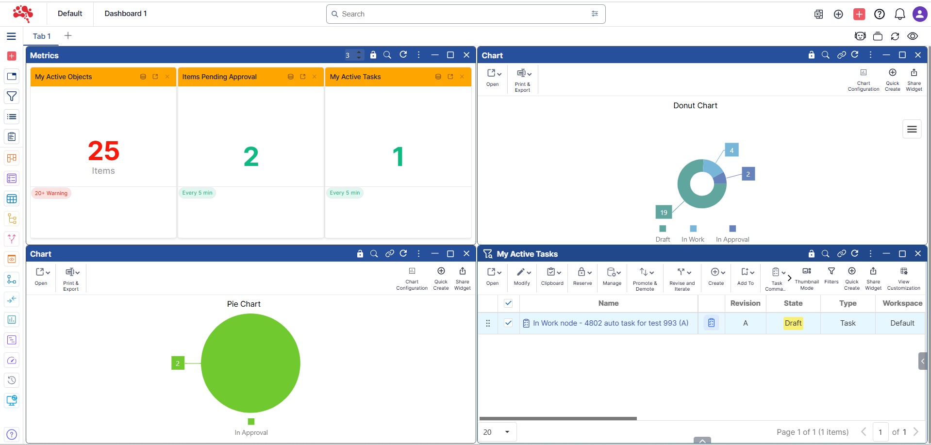
Interactive and Dynamic Features
Engage with data through hover and click actions, apply filters, and customize views to explore information in a way that suits your analysis needs.
Hover & Click Interactions – View details or drill down for deeper insights by hovering or clicking on chart elements.
Filters & Customization – Adjust time ranges, datasets, or dimensions to focus on relevant data.
Real-Time Data – Always see the latest insights with live chart updates as data changes.
Data Labels, Legends, and Trend Insights
Enhance chart readability and decision-making with clear labels, intuitive legends, and visual cues that track KPIs and reveal long-term patterns. These elements ensure every data point is easy to interpret and act upon.
Data Labels
Show key details like names, statuses, costs, or time periods directly on the chart
KPI Tracking
The chart can track specific KPIs, such as product development progress, costs, time-to-market, or resource allocation.
Legends
Explain colors or symbols to clarify data categories and meanings.
Trend Lines
Some charts may include trend lines or reference lines to highlight key thresholds or show long-term patterns.
Benefit of Nora IPLM's Chart Widget
The Chart Widget in Nora IPLM empowers teams with real-time, visual insights that simplify complex data and highlight key trends. By combining multiple chart types, interactive features, and live updates, it enables faster decision-making, better collaboration, and a clear view of product performance throughout its lifecycle.
Visualizing data through charts makes it easier to understand complex information, patterns, and trends, which might be difficult to interpret in raw text or numerical form.
By providing clear and intuitive visualizations, the Chart Widget enables faster, more informed decision-making for teams at all levels of the organization.
Charts that are updated in real time ensure that teams have access to the latest data and can respond quickly to changes in the project, costs, or supply chain.
Charts allow teams to quickly spot anomalies, inefficiencies, or risks, enabling them to take corrective actions before problems escalate.
Visualizing data makes it easier for different teams (engineering, design, manufacturing, etc.) to communicate and collaborate, as everyone can see the same information in an easily understandable format.
Uses of the Chart Widget in Nora IPLM System
Flexible Data Sources
The chart can be used to show the progress of various product development stages, allowing teams to see which milestones have been completed and which are still pending.
Custom Thresholds & Color Indicators
Define statuses with personalized labels and colors for clear visibility.
Real-time Updates
Auto-refresh metrics at chosen intervals to always work with the latest data.
Smarter Metrics, Always Up to Date
Nora IPLM’s Metric Widget gives you complete control over how metrics are captured and displayed. Pull data from flexible sources, set custom thresholds with clear visual indicators, and rely on real-time auto-refresh to keep every decision aligned with the latest insights.
Insights Made Clear and Actionable
With Nora IPLM’s Metric Widget, you can customize labels, formats, and precision to match your needs while keeping data simple and easy to read. Bold visuals and color-coded thresholds ensure teams grasp key insights instantly, making dashboards more effective and decision-ready.
Display Customization
Personalize labels, number formats, and decimal precision for clear, tailored insights.
Simple, Visual, and Effective
Present bold numbers with color-coded thresholds for quick, at-a-glance decisions.
Custom Filters
Choose whether data comes from custom filters or predefined methods.
Alert Stages
Define multiple threshold levels to capture varying stages of alerts.
Real-time Updates
Enable/disable real-time updates based on performance needs.
Metric Dashboard
Apply different metrics per dashboard tab to serve multiple monitoring purposes.
Configuration Options That Fit Your Workflow
Nora IPLM’s Metric Widget adapts to your needs with flexible configuration settings. From choosing data sources and display formats to setting thresholds and refresh intervals, you control exactly how metrics are captured, displayed, and updated.
Layout and Card Settings
With Nora IPLM’s Metric Widget, you can customize labels, formats, and precision to match your needs while keeping data simple and easy to read. Bold visuals and color-coded thresholds ensure teams grasp key insights instantly, making dashboards more effective and decision-ready.
Metric Cards
Allows users to control how many metric cards are displayed side by side in a single row.
Simple, Visual, and Effective
Present bold numbers with color-coded thresholds for quick, at-a-glance decisions.
Powerful Modules for Every Stage of Product Development
Nora IPLM modules are designed to work effortlessly in a one unified platform, helping teams to collaboration across the entire product lifecycle. From ideation to execution, each module brings clarity, control, and scalability without the complexity of traditional PLM systems.
Frequently Asked Questions
The Chart Widget turns complex PLM data into visual insight. Instead of scanning tables or reports, users can quickly understand trends, distribution, and performance through clear charts.
PLM decisions are often time-sensitive.
The Chart Widget helps teams spot patterns, risks, and progress instantly—without exporting data or building external reports.
Managers don’t need to dig into records to understand what’s happening.
The Chart Widget provides a high-level view of health, workload, and bottlenecks – making reviews faster and more focused.
No. While leaders benefit from summaries, teams also use charts to:
Track execution progress
Monitor workload balance
Identify delays early
Support daily stand-ups and reviews
Exports break context and go stale quickly.
The Chart Widget stays connected to live PLM data, ensuring insights are always current and traceable back to source records.